This is an ongoing project with which I am still collaborating to improve internal interfaces. Recently, we’ve started to design and develop of a multi-platform mobile app.
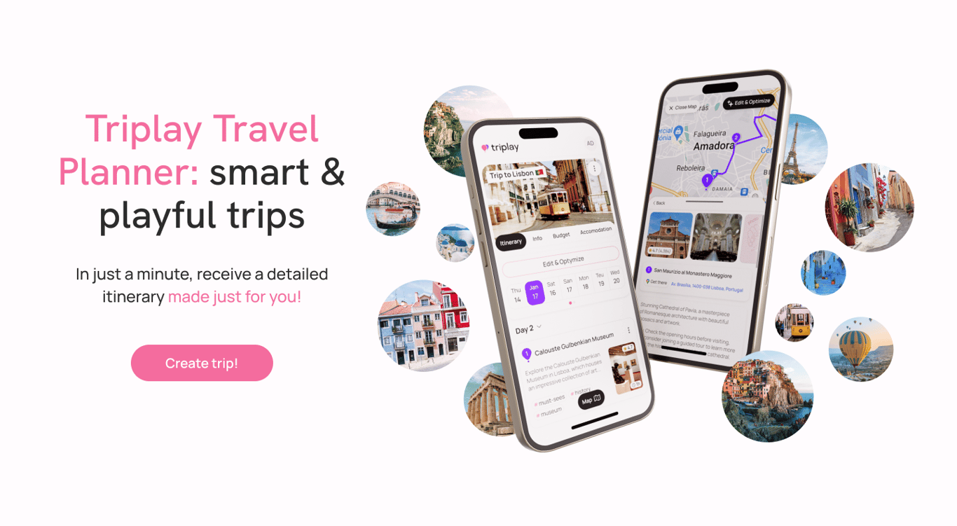
Client: Triplay (soon to be TripTip) is a B2C AI travel planning startup. Their service allows travelers to quickly create convenient and interesting tourist routes based on their interests in any city worldwide.
Problem: They reached me with a problem of users rapidly leaving their service after entering it. User interviews and session recordings revealed that people were struggling to understand how to use the service due to its overly complex and confusing interface. The service wanted to improve its usability metrics to become a confident player in the growing AI travel planner market and attract more investments.
We have been collaborating since August 2023. Due to restricted budget, we couldn't afford redesigning the entire look of the service at once, so each time we focused on redesigning a specific new element, component, or flow. Finally, in mid-April 2024, the startup is ready to announce the release of the new UI!
Before / After
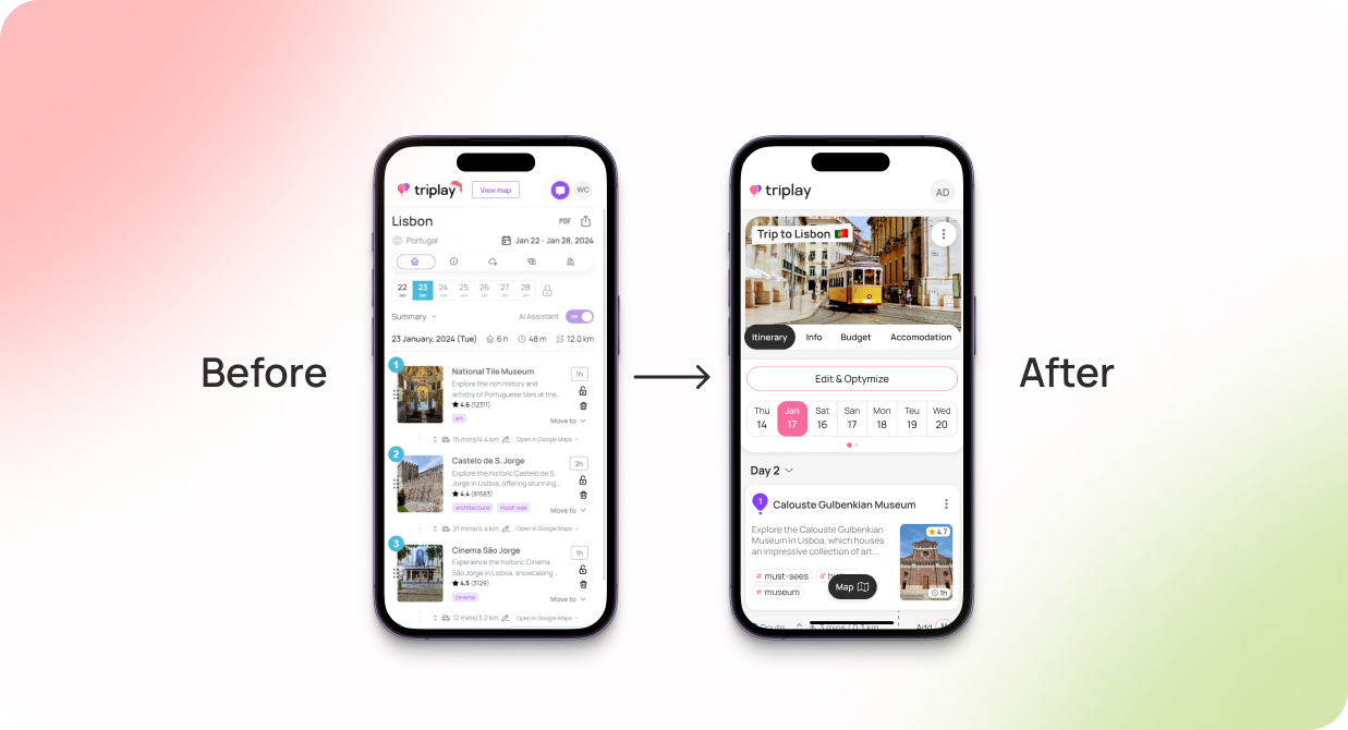
The original UI had many elements with confusing meaning (lock icons, AI assistant toggles, etc.). Additionally, there was no established visual hierarchy of elements, making it unclear where to look first.
I removed all unnecessary and duplicated elements, established a clear hierarchy of elements, and relocated the map mode toggle button to a more obvious place. The service usage became more pleasant — user feedback is the best confirmation of this.
High-fidelity wireframes
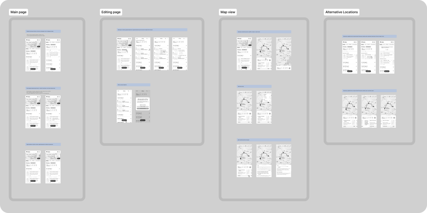
Using high-fidelity wireframes, I demonstrated the improved logic of the service to the team. We made wireframes only for the main flows: all additional flows were made upon agreed design.
The number of base flows:
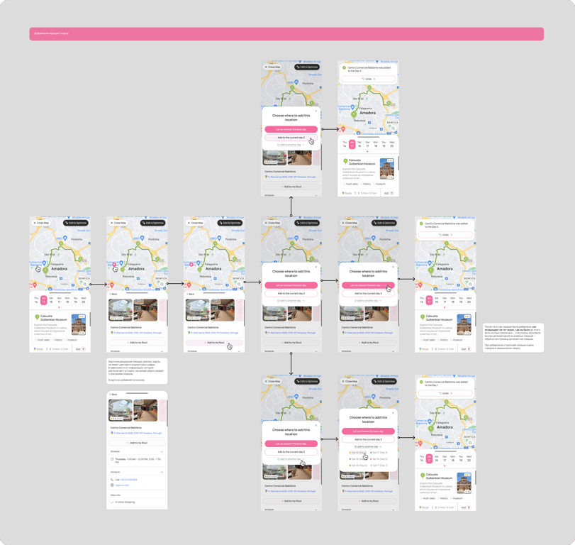
An example of a flow of adding a location from a map to the route:
Example of a Flow of moving a location from one day to another:
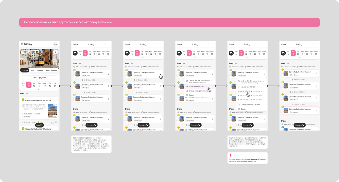
I add comments for developer to many screens.
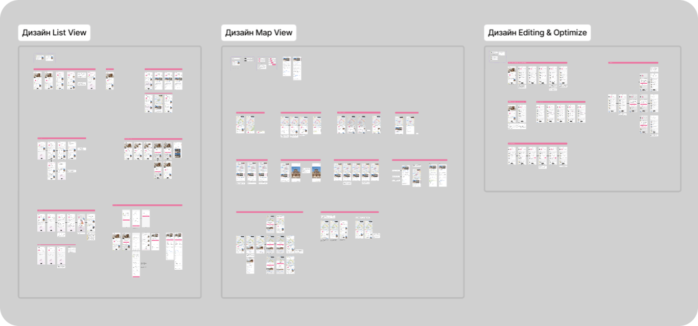
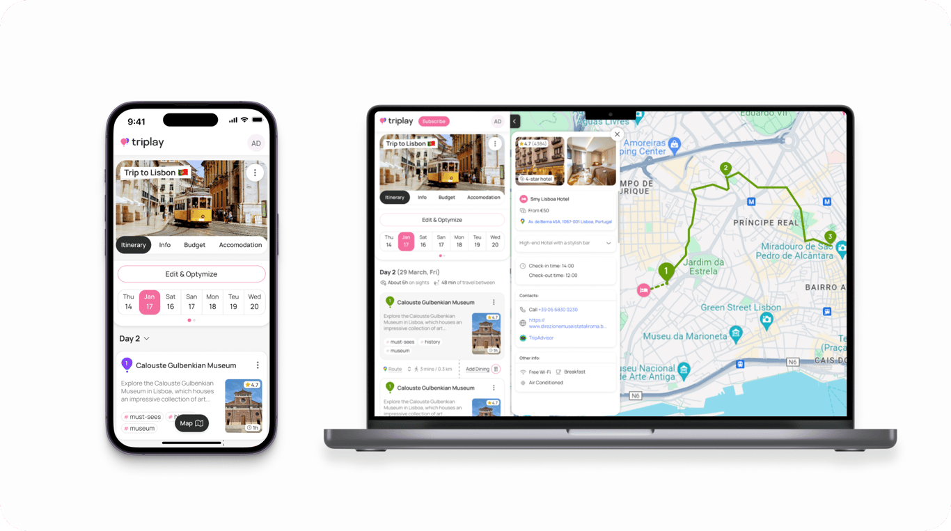
Using mobile-first approach
According to statistics, over 80% of the service's users access it from mobile devices, so I suggested taking a mobile-first approach. Therefore, at first, I developed mobile interfaces, which seamlessly fit to desktop too. This significantly sped up the development and reduced the cost of updating the layout.
 Made with Bullet